Golden Ratio Made Simple for Graphic Designers
Some designs just feel right. They look balanced, natural, and easy on the eyes—even if you can’t explain why. That’s often because of the Golden Ratio, a simple design principle that has been used for thousands of years in art, architecture, and now, graphic design.
What is the Golden Ratio?
The Golden Ratio is a number: 1.618. If you take a line, divide it into two parts, and the longer part divided by the shorter part equals 1.618, you’ve got the Golden Ratio.
Think of it like this: It’s a way of dividing space that looks naturally pleasing. We see it in seashell spirals, sunflower seeds, and even the human face. That’s why it feels so familiar.
Why Designers Love It
The Golden Ratio helps create balance, proportion, and harmony in design. It gives you a guide for where to place things so they don’t look too crowded or awkward.
Here are a few simple ways you can use it:
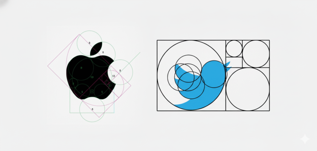
1. Logos
Ever wondered why some logos just look perfect?
Take the Apple logo—its curves and proportions are designed around the Golden Ratio, giving it a sense of natural perfection. Similarly, Twitter’s bird logo is built using overlapping circles sized according to the Golden Ratio, creating balance and motion that feels right to the human eye.
By basing shapes and curves on this ratio, logos gain a timeless, organic appeal that connects instantly with viewers.
2. Typography
The Golden Ratio can help define a natural text hierarchy.
Say your body text is 16px. Multiply it by 1.618, and you get about 26px—a perfect headline size that feels balanced without trial and error.
Here’s how it works:
- Headline: 26px (16 × 1.618)
- Body Text: 16px
- Subheading or Caption: 10px (16 ÷ 1.618)
Layout and Composition
Imagine you’re designing a poster or a website layout.
Instead of placing your image right in the middle, use the Golden Ratio grid or spiral to guide placement. The focal point—say, a product image or headline—can sit slightly off-center, where the spiral ends. This placement feels more dynamic and naturally draws the viewer’s attention.
Designers often overlay the Golden Spiral (based on the ratio) to decide where to position key visual elements like text, images, or CTAs. It’s an easy way to make any layout feel thoughtfully composed.
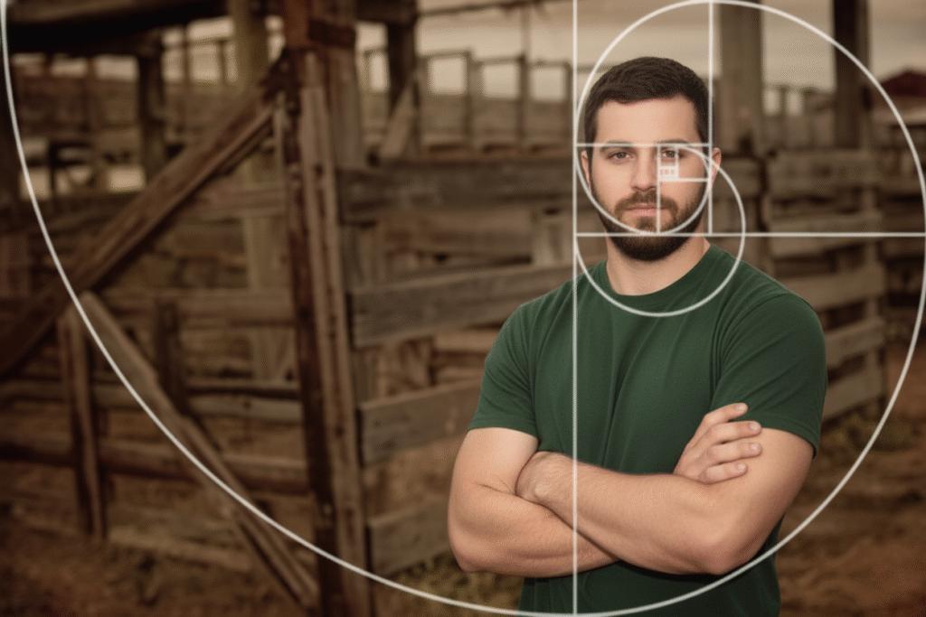
Cropping Images
Photographers often use the Golden Spiral (a curve that follows the Golden Ratio) to position their subject. For example, placing a person’s face along the spiral makes the photo look more professional.
Quick Example
Picture designing a social media post:
- You have a big product photo.
- Use the Golden Ratio to decide where to place your call-to-action text. Instead of just guessing, you align the text where the spiral naturally ends. The design instantly feels balanced.
- Credit cards and product packaging: Many rectangular designs use the Golden Ratio to define their proportions, making them more comfortable to hold and visually appealing.
- Instagram’s grid interface: The spacing and photo ratios align closely with the principles of the Golden Ratio, creating a visually cohesive experience.
Do You Have to Use It Every Time?
Not really. The Golden Ratio is a tool, not a strict rule. Some modern designs break it completely to stand out. But if you ever feel stuck or your design looks “off,” the Golden Ratio can help you fix it.