How Fonts Change the Mood of Your Message
Introduction
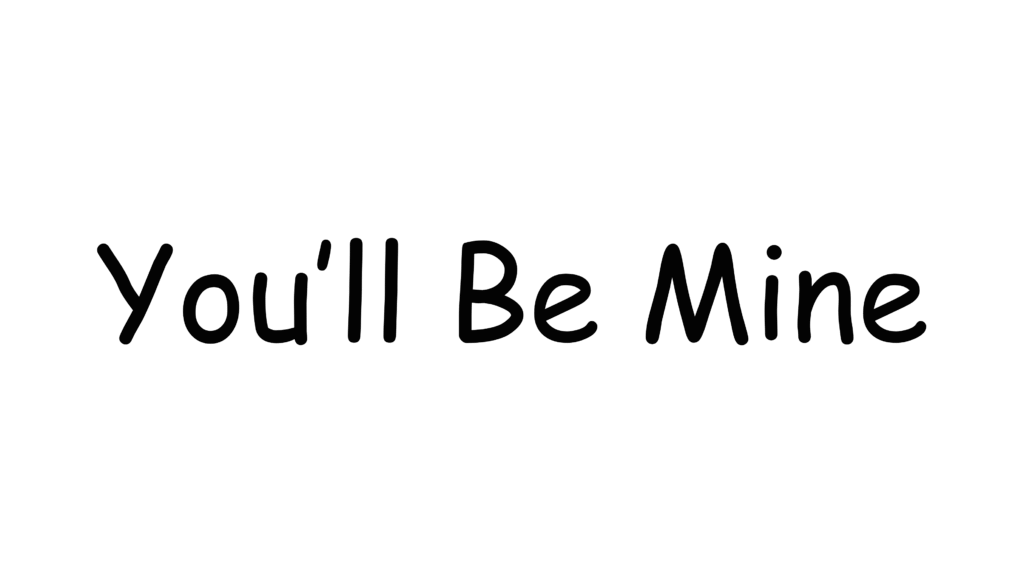
“You’ll Be Mine”
Now, see how this same sentence transforms when expressed in different font styles.
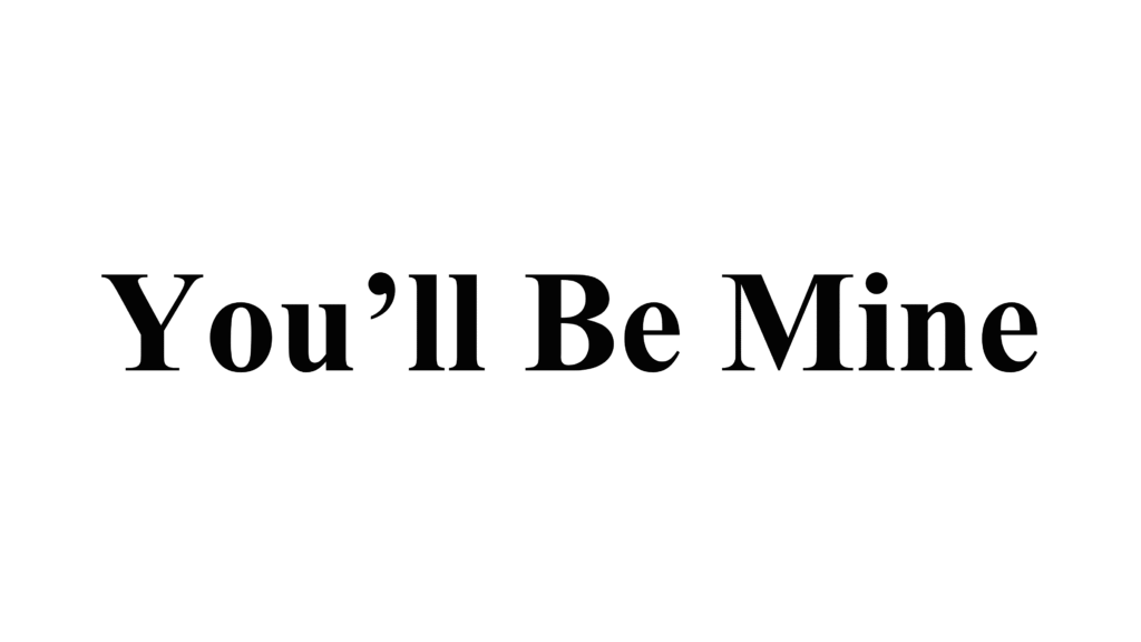
1. Serif Fonts – Classic and Trustworthy
Example:
“You’ll Be Mine” (in Times New Roman or Garamond)
Serif fonts carry small decorative strokes—called serifs—at the ends of letters. They give your text a timeless, elegant look.
Where to use: Books, newspapers, luxury branding, formal invitations.
Why it works: The structured form and subtle detailing convey tradition, stability, and trust.
Visual example: Think of The New York Times logo or Vogue magazine—both rely on serif fonts to project credibility and sophistication.
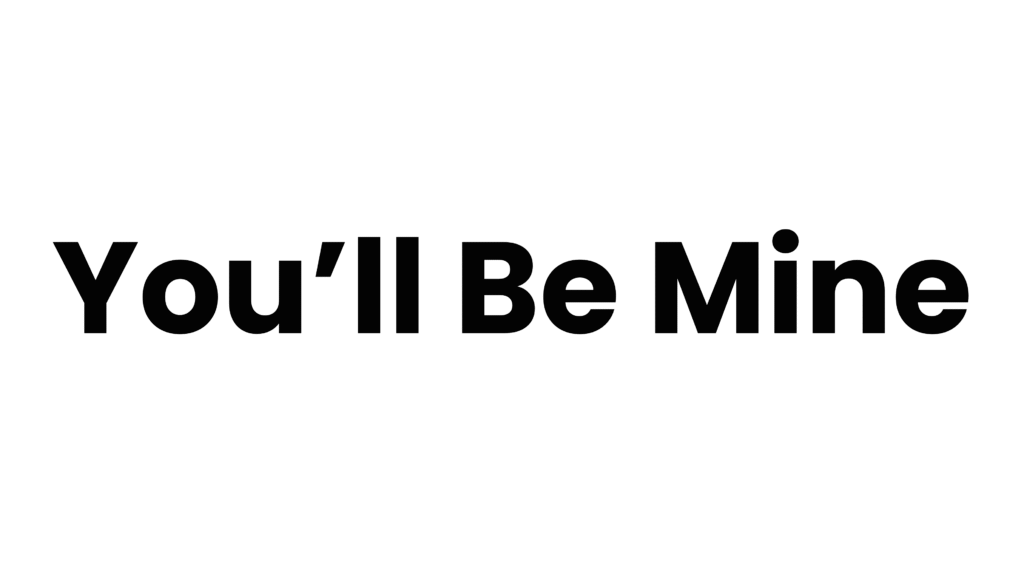
2. Sans-Serif Fonts – Modern and Clean
Example:
“You’ll Be Mine” (in Helvetica, Poppins, or Montserrat)
Sans-serif fonts skip the decorative endings, giving a fresh, uncluttered appearance.
Where to use: Websites, apps, social media posts, corporate communications.
Why it works: Sans-serifs are easier to read on screens and bring a minimal, forward-thinking feel.
Visual example: Think Google’s clean logo or Airbnb’s identity—simple, friendly, and digital-first.
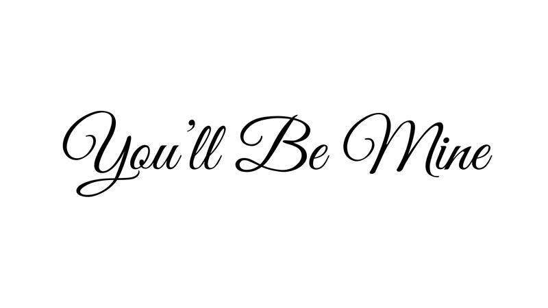
3. Script Fonts – Romantic and Personal
Example:
“You’ll Be Mine” (in Great Vibes, Pacifico, or Dancing Script)
Script fonts mimic handwriting, bringing intimacy and emotion into design.
Where to use: Wedding cards, love notes, boutique branding, lifestyle blogs.
Why it works: The fluid strokes add warmth, personality, and elegance.
Visual example: Brands like Lindt or Coca-Cola use script fonts to create emotional connection and a personal touch.
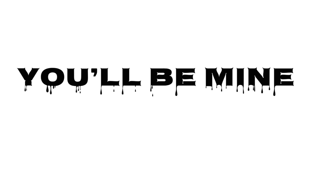
4. Horror / Display Fonts – Bold and Dramatic
Example:
“You’ll Be Mine” (in Creepster or Nosifer)
Display fonts command attention—sometimes through distortion, sharp edges, or exaggerated forms.
Where to use: Movie posters, gaming graphics, event promotions.
Why it works: These fonts are designed to provoke, shock, or thrill—instantly setting a dramatic tone.
Visual example: Think of the Stranger Things title font—instantly eerie, nostalgic, and unforgettable.
5. Fun / Playful Fonts – Lighthearted and Friendly
Example:
“You’ll Be Mine” (in Fredoka One, Comic Neue, or Baloo)
Playful fonts are full of personality—round, soft, and cheerful.
Where to use: Kids’ books, party invites, fun campaigns, creative startups.
Why it works: These fonts radiate friendliness and approachability, perfect for casual, energetic communication.
Visual example: Brands like LEGO or Nickelodeon use rounded, colorful fonts to create excitement and joy.
Beyond Aesthetics: What Typography Communicates
- Font Weight – Bold fonts grab attention; thin fonts convey elegance.
- Letter Spacing (Tracking) – Tight spacing creates intensity; wide spacing gives calm and openness.
- Case (Upper/Lower) – ALL CAPS feels assertive or loud; lowercase feels friendly and relaxed.
- Contrast – Combining two font styles (like serif for headlines, sans-serif for body text) builds visual hierarchy and rhythm.
Design Tip: Showcase Fonts Like a Story
When presenting different font moods on your website or blog, enclose each “You’ll Be Mine” example in a styled box, like a code snippet block.
This creates clear separation and gives each mood its moment—making the reading experience both engaging and educational.
You can also add small icons, color accents, or background textures that match each tone—like rose petals for script, dark shadows for horror, or bold colors for playful fonts.