The Von Restorff Effect: Why Standing Out Gets Remembered
Introduction: The Power of the Unexpected
Ever noticed how the “Most Popular” Netflix plan jumps out, or why your eye goes straight to a red “Buy Now” button in a sea of neutrals? That’s design psychology at work, specifically the Von Restorff Effect—a principle proven to make people remember the odd one out.
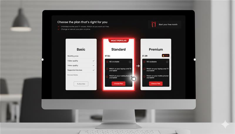
Netflix subscription plans with the Standard plan visually isolated to highlight and guide user attention.
Coined by psychiatrist Hedwig von Restorff in 1933, this phenomenon reveals: when similar items are presented together, the one that’s visually or contextually different is most likely to be recalled. For UX designers, that’s not just theory; it’s a concrete strategy for guiding user attention and making decisions effortlessly.
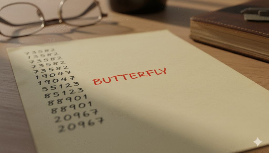
The Classic Study: One Word in a Sea of Numbers
Why It Works: Attention and Salience
UX and Everyday Examples: From Streaming to Shopping
- Subscription Pages: On Netflix or Spotify, “Most Popular” is highlighted—bigger, brighter, and sometimes with a badge. Your eyes can’t help but notice, and that’s driven by deliberate isolation.
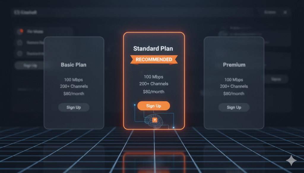
Netflix subscription plans comparison highlighting the Premium plan with bright red for emphasis.
- Recharge Portals: TV/data plans often spotlight a “Recommended” choice with bold color or outline. Users are gently nudged—while the standout gets remembered, and the decision feels easy.
- CTA Buttons: Amid gray links, the brightly colored “Sign Up” or “Buy Now” button stands out, making it the clear action.
- Error Messages: Red errors are universally noticed. It’s not just color theory—it’s isolation in action.
Applying the Von Restorff Effect: Strategies for Designers
- Highlight the Primary Action: Make one main CTA stand out through color, size, or placement.
- Emphasize Key Info: Use distinctiveness for pricing, alerts, or new features—let them pop.
- Use Isolation Sparingly: If everything stands out, nothing does. Reserve contrast for priority actions.
- Leverage Visual Hierarchy: Typography, spacing, and layout can naturally isolate what matters.
Key Takeaways: Memorable by Design
- Users notice and remember what’s different.
- Distinct UI elements drive better recall, clicks, and decisions.
- Subtle but purposeful contrast makes interfaces intuitive.
- Overuse kills the effect—keep isolation strategic.