Jakob’s Law: Why Familiarity Builds Better UX
Introduction
Users spend most of their time on other websites and apps — not yours.
That means when they arrive at your product, they bring expectations shaped by those other experiences.
This is the essence of Jakob’s Law, proposed by Jakob Nielsen, co-founder of the Nielsen Norman Group with Don Norman (of Apple fame).
It states:“Users prefer your interface to work the same way as all the other interfaces they already know.”
In short — people don’t want to learn how your product works.
They want it to feel familiar from the first click.
The Psychology Behind Jakob’s Law
Humans are wired to recognize patterns. When a design follows a pattern the brain already understands, it reduces cognitive load — the mental effort required to process information.
Every time a user doesn’t have to figure something out, you’re saving them time and frustration.
That’s why familiarity breeds comfort — not boredom.
Jakob Nielsen also introduced the concept of discount usability engineering — making small, fast, and affordable design improvements that significantly enhance usability.
And the quickest win is often the simplest:
Follow existing conventions.
Real-World Examples of Familiarity in Action
1. Ola, Rapido & Uber
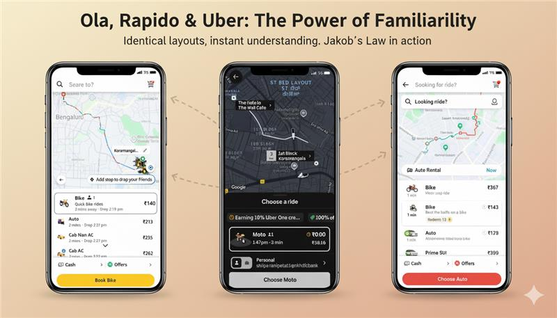
- A map on the home screen showing your current location
- A “Where to?” search bar at the top
- Ride type and fare estimate near the bottom
- Driver details on confirmation
2. Zomato & Swiggy
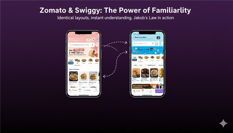
- A prominent search bar for restaurants and cuisines
- Scrollable lists of dishes and offers
- Floating cart button at the bottom
- Consistent color-coding for vegetarian/non-vegetarian indicators
3. AI Chat Interfaces (ChatGPT, Copilot, Perplexity, Gemini, Grok)
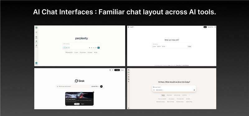
- A central chat area
- Sidebar for past conversations
- Input box at the bottom
- Minimalist, distraction-free interface
Even subtle design consistency across brands makes the entire ecosystem easier to adopt.
Color Conventions: The Red Signal Effect
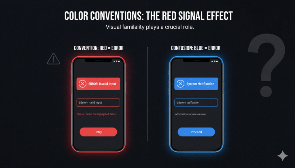
Try using blue to indicate an error, and you’ll confuse your users — because blue usually communicates neutrality or links.
Following these established color conventions helps users respond instinctively, reducing hesitation and error.
Why Familiarity Works
- Reduces learning time: Users already know how to navigate.
- Builds trust: Familiar interfaces feel safe and reliable.
- Boosts conversions: Less confusion means more action.
- Improves accessibility: Familiarity supports predictable user journeys.
Applications in UX Design
- Navigation Layouts: Keep standard placements for menus, carts, and filters.
- Button Styles: Maintain familiar shapes, placements, and contrast.
- Forms: Use standard validation patterns (green for success, red for error).
- Icons: Choose universally recognizable symbols — search, heart, cart, menu.
Key Takeaways
- Jakob’s Law reminds us that users’ expectations are built elsewhere — not in our product.
- Familiarity reduces friction, helping users complete tasks faster.
- Innovation should enhance usability, not replace what users already know.
- A familiar foundation creates space for creative expression.
Conclusion: In a World of Noise, Stand Out Deliberately
The most intuitive interfaces don’t surprise users — they guide them seamlessly. Because in UX, the most powerful innovation often begins with familiarity.